Forum - View topicMost Aesthetically Daring Tournament: Nominations (ABOUT TO START)
|
Goto page Previous 1, 2, 3, 4, 5, 6, 7, 8, 9 Next |
| Author | Message | ||
|---|---|---|---|
|
Ignatz
|
|
||
|
Nominating:
Gankutsuou The visuals in this anime are absolutely stunning. Everything looks as vibrant and attention-grabbing as possible. The show features 3D backgrounds, and in order for the 2D characters not to look strange, the creators decided to photoshop complex textures into the clothing and hair. The textures don't move with the characters, creating a very unusual experience. Trailer |
|||
|
Jose Cruz
Posts: 1810 Location: South America |
|
||
|
Supporting, additionally:
- Madoka - Hidamari Sketch - EVA - Revolutionary Girl Utena Really like Anno and Shimbo's visual styles. Nominating: Spirited Away Aesthetically it is perhaps not as aggressively daring as other movies such as Mindgame, but it's visuals are incredibly beautiful, aided by the incredible effort put into Ghibli's productions and is significantly more creative and daring visually than other Ghibli films. While they are always beautiful and characterized by a rich visual language, Miyazaki's films are not usually very daring aesthetically, but in this case I think that Miyazaki was really "aggressive" and created something that I found extremely impressive in a visual level, these screencaps for instance (though of poor quality, give an idea of the surrealistic visual qualities of the film) give an idea of the enormous visual diversity of the film: http://www.youtube.com/watch?v=C1yoXdG8jVg 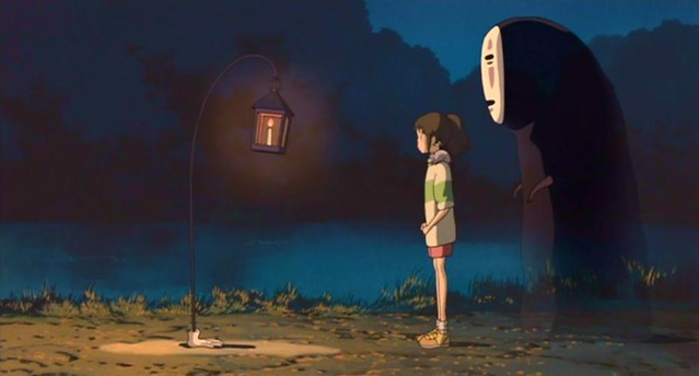
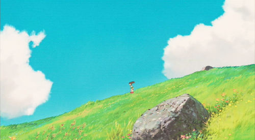
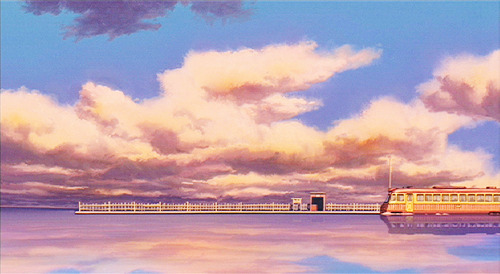
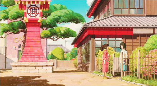
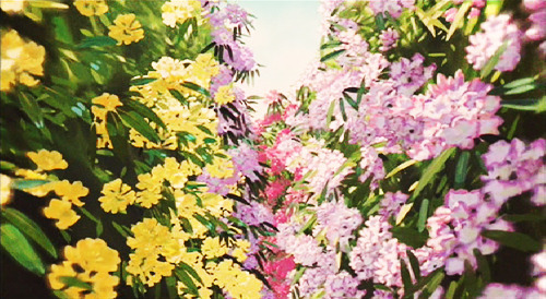
Also, Chihiro's character design is quite different from most other anime while being clearly influenced by the standard design and note how rigorously arranged is the composition of every scene, simultaneously aggressive and elegant. Last edited by Jose Cruz on Mon Jun 16, 2014 9:46 am; edited 2 times in total |
|||
|
|||
|
marie-antoinette
Posts: 4136 Location: Ottawa, Canada |
|
||
|
I will support Gankutsuou, which I would have been nominating myself later today if no one else had.
Also, after some debate, I am going to vote against both Attack on Titan and Fantastic Children. I don't think either of them do anything particular daring when it comes to aesthetics - they have some decent designs but nothing else ever struck me as that interesting or innovative. I'm planning to nominate Serial Experiments Lain at some point (if anyone wants to nominate it before I have a chance, go right head, I'll definitely give you a supporting vote). Nothing else is immediately popping into mind but that may change as I think about it some more. |
|||
|
|||
|
Akane the Catgirl
Posts: 1091 Location: LA, Baby! |
|
||
|
Overall Supporting:
EVA Madoka Space Dandy Spirited Away (Added) Overall Nominations (by me): Attack on Titan Cowboy Bebop FLCL Soul Eater Additional Nominations: Nausicaa of the Valley of the Wind: Yes, as long as we're nominating Miyazaki movies, I'm giving input! Before I begin, let me get one thing straight; I just like this movie. I don't absolutely love it, but I did love the art and music put into this. The flight scenes are absolutely beautiful, the designs are creative, and the animation is top-notch. By the way, did you know Hideaki Anno of EVA fame animated the God Warrior scene? You can tell by the melting flesh and goo. |
|||
|
|||
|
Jose Cruz
Posts: 1810 Location: South America |
|
||
|
I though of nominating Spirited Away because it's aesthetically daring through it's surrealistic visual style, I wouldn't think that his other movies are aesthetically daring even though they are beautiful works of visual art. Nausicaa for instance is one of my favorite anime titles but I didn't think of nominating it because it appears to be rather conventional visually even though it's visuals are qualitatively top notch.
|
|||
|
|||
|
RadarJay
Posts: 51 |
|
||
|
As far as magical girl series go, I'd say that PPMM definitely has some of the most interesting thought going into color schemes/costume/weapon design. And of course Tatami has some awesome color symbolism, BUT HOW CAN YOU FORGET ABOUT ME, THE INCOMPARABLE AND MAJESTIC JOJO!? BEHOLD MY GLITZ AND GLAM AND STRONG JAW LINES!
|
|||
|
|||
Spastic Minnow
 Bargain Hunter Bargain HunterExempt from Grammar Rules Posts: 4640 Location: Gainesville, FL |
|
||
|
Because cats, death, and surrealism go together like natto, rice, and eggs... (you know, some can't live without it, others can't understand how you can stand such a thing)
Nominating: Tamala 2010: A Punk Cat In Space A great achievement of pop art. Deconstructing Hello Kitty and Tezuka era 60's animation. A tale of an always 1-year old cute little rebelous kitten whose image is seen over millennia, apparently denying death and possibly unwittingly bringing upon revolution, with art that is ready to be framed and put on the wall of any modern hipster or art fan. Animated almost completely in Black and White, Cutesy characters mixed with surreal settings and iconic imagery. It also intermittently cuts to a CGI [dream?] sequence of a our cartoon heroine ascending through a dark city-scape on an escalator to meet with a giant mechanical Cat Goddess. the plot is slow, confusing, and unfinished (although, to me, fascinating) but the art is consistently weird and engaging.) Trailer pic pic pic pic pic Cat Soup Packs enough visual flair to fill out a feature length movie or a complete season of a Noitamina show into 30 minute. This arty OVA about a couple kitten siblings wandering through the land of the dead to retrieve the missing half of one of their souls (or something like that) is complete surrealism. In the commentary track of the DVD one of the directors admits there is no meaning, they just move from one cool sequence to another with little care for narrative. The result is a trippy ride that doesn't really make any sort of sense, but you have to see to believe. It's easily found on the net... but not exactly "legally"... so I won't link to it, but here's a... AMV with better resolution than the available trailers ...I was also going to nominate Night on the Galactic Railroad to fill out a thematic threesome, but after more thought I'm not quite sure daring theme is quite matched by its only occasionally surreal art. I won't vote against it if anyone else wants to nominate it though. |
|||
|
|||
|
Redbeard 101
Oscar the Grouch
Forums Superstar Posts: 16979 |
|
||
|
I suppose I'll participate in this one since I abstained from the last 2.
Support: Mononoke Tsuritama Redline Kemozoume Revolutionary Girl Utena Nichijou Cromartie High School Nominations: I'm going to use trailers for the visual aids as I hate spoiling things for people. So in case people haven't seen the shows the official trailers, and a few pics, hopefully won't ruin anything for anyone. Gilgamesh:. I am a fan of horror shows and darker backgrounds and scenery. Gilgamesh has both qualities. The character designs are more unique and not the typical flair. The show itself is just...dark. The scenes and backgrounds all have a sort of dark grey scale tone to them. A very gothic sort of feel I thought. Everything seems more muted, dark, and brooding. It might not have been the most original premise story wise but this is about aesthetics. In that aspect this show i think is very strong and stands out from many others. The original extras on the single dvd releases also had a lot of behind the scenes info on making that feel to the show. They actually lowered the lights in the recording booths and had candles lit to give off the sort of atmosphere to the VA's themselves. Definitely not the norm. Trailer: Pic 1 Pic 2 Boogiepop Phantom: Where as Gilgamesh has a nice dark grey scale/gothic tone to it visually Boogiepop has a straight up dark and faded feel to the visuals. A sort of fuzzy and dark soft tone often. Boogiepop is also dark in tone so the darker and "hazy" visuals really add to the atmosphere. Where Gilgamesh is more gothic in tone Boogiepop to me is more traditional dark horror in its visuals and atmosphere. Watching this show at night with the lights off only adds to the ambiance. Trailer Pic 1 Pic 2 Pic 3 Red Garden: I feel like I am repeating myself by saying it has dark visuals lol. There are differences in Red Garden from my other 2 nominations. With Gilgamesh it's a more of gothic dark feel, Boogiepop is a more hazy and ethereal dark horror feel, while Red Garden's visuals are more....crisp I guess is the best word to use. The tone, atmosphere, story and visuals are still often quite dark and broody like the other two but the visuals and characters designs in RG are more crisp and "pop" a bit more. And again, the characters designs are not the norm. Fortunately the show manages to keep the darker more thriller/horror atmosphere going despite having more crisp and clean visuals and not always taking place at night itself. Trailer Pic 1 Pic 2 Aria: To break up my run of "dark" aesthetic shows I'll toss out a nice bright and sunny one. All of the Aria tv series have very bright and colorful visuals. The character's outfits, various hair colors, and backgrounds all are simply bright and gorgeous I think. The show exudes calmness. The visuals really help push that light and airy tone. It's not just bright and colorful to simply be bright and colorful. When you watch the show and the backgrounds you feel calmer. You relax. It's a feel good show in that the story and aesthetics are there to simply mellow you out and make you relax. It's almost like taking a visual vacation I think. And the neo-venice setting and designs also feel very artistic and unique while being relaxing. Here are links to the other 2 tv seasons Aria the Origination & Aria the Natural Trailer 1 Trailer 2 Pic 1 Pic 2 Pic 3 Pic 4 |
|||
|
|||
|
Jose Cruz
Posts: 1810 Location: South America |
|
||
|
Additionally supporting: Aria.
|
|||
|
|||
Spastic Minnow
 Bargain Hunter Bargain HunterExempt from Grammar Rules Posts: 4640 Location: Gainesville, FL |
|
||
|
^^^^
Psycho If they make it into the tourney each description will stand on its own. You should probably rewrite those so they just describe each show by itself instead of in relation to each other. Maybe put commentary about the relative darkness of each outside of the description. Supporting: Mind Game Noein Flag Freedom Kuuchuu Buranko (aka Trapeze or Welcome to Irabu's Office) Kemozoume Neon Genesis Evangelion Mononoke tsuritama Gatchaman Crowds FLCL Nichijou Redline Puella Magi Madoka Magica Gankutsuou Spirited Away Nausicaa of the Valley of the Wind Red Garden |
|||
|
|||
|
One-Eye
Posts: 2273 |
|
||
|
I'm a little tired so I'm just going to knock these out real quick and come back later and add more details to descriptions.
Nominating: Ping Pong The style is purposely rough and sketchy. Comic like panels show up at times to give the viewer a view of multiple scenes with some being static and others being "live". Flying is a recurring motif sometimes symbolized by planes, birds, flying robots and flying heroes representing desires, personalities or character traits. There's too many exciting scenes in this show, but here is a few. Ping Pong OP Smile is Robotman Kazama is a Monster Magnetic Rose Space travelers are drawn into a surrealistic and haunting setting based from people's memories. This was the best I could find: AMV may contain spoilers Paprika Psychoanalysis, the subconscious, dreams, technology and reality collide and blur our perceptions. Paprika trailer Paprika OP Voting for/Supporting: Puella Magi Madoka Magica Gankutsuou Spirited Away Red Garden Voting Against: Attack on Titan I didn't really find anything particularly daring, inventive or exceptionally creative in style, character design or scene composition in AoT. |
|||
|
|||
|
rosebrook11
Posts: 1181 |
|
||
|
Supporting
Soul Eater FLCL Nichijou Redline Lupin the Third: The Woman Called Fujiko Mine Puella Magi Madoka Magica Gankutsuou Ping Pong Paprika |
|||
|
|||
|
rheiders
Posts: 1137 Location: Colorful Colorado :) |
|
||
|
Voting for:
Madoka Magica Gankutsuou Ping Pong Paprika |
|||
|
|||
|
Ignatz
|
|
||
|
Voting for:
Tamala 2010: A Punk Cat in Space Cat Soup Paprika |
|||
Spastic Minnow
 Bargain Hunter Bargain HunterExempt from Grammar Rules Posts: 4640 Location: Gainesville, FL |
|
||
|
And we haven't even gotten through half of the impressive shows that appeared in 2010...
House of Five Leaves The subdued palette, severe features and and blank eyes fit this show to a T. It's a subdued show of flawed and usually very depressed characters and their mask-like features cover who they are even as their actions reveal their true selves and alliances. Eventually you see it all as stark beauty. Occasional splashes of color, especially of deep red, keep things from getting too dreary though. Trailer Otome Yokai Zakuro The Character designs aren't so daring, but this show adds so many impressive accents to the bishojo and bishonen cast and settings. Backgrounds are impressively complex and beautiful, monster transformations are unique and scary and when the heroines fight, they tend to do so with dazzling flower petal displays. The show got a little overshadowed with other crazily inventive arty shows, but the way the art in this one enhanced an otherwise somewhat typical demon-fighting slash romance kept your attention in a more impressive way. It made you continue a show you might not have bothered with without its artistry. Show Preview Fight Katanagari Simple cartoony character designs merged with dynamic action, bright colors, and an always changing backdrop. The art parallels the story to a fashion, at first you think it's simple, but eventually you see that it's actually very well thought out and that the cheery colors and prettiness covers a complexity and darkness you didn't notice at first. trailer Last edited by Spastic Minnow on Sat Jul 26, 2014 8:52 am; edited 1 time in total |
|||
|
|||
|
All times are GMT - 5 Hours |
||
|
|
Powered by phpBB © 2001, 2005 phpBB Group
