RIGHT TURN ONLY!!
Wine Drops Keep Fallin' On My Head
by Carlo Santos,

Another Anime Expo has come and gone—but the biggest thought on some people's minds is probably Comic-Con, just a couple of weeks from now. And for those who really have their game plan together, they're probably thinking about lining up to register for next year's Comic-Con already...
ATTACK ON TITAN

Vol. 1
(by Hajime Isayama, Kodansha Comics, $10.99)
FROM THE BACK COVER:
"For the past century, what's left of mankind has hidden in a giant, three-walled city, trapped in fear of the bizarre, giant humanoids known as the Titans. Little is known about where they came from or why they are bent on consuming humankind, but the sudden appearance of an enormous Titan is about to change everything..."
EVIDENCE FOR:
With its choice of ruthless, man-eating giants as villains, Attack on Titan taps into an archetype as old as the first civilizations. But the far-fetched setting and quick pacing are decidedly modern, and fans of blockbuster action will feel right at home amidst the chaos. This first volume covers a surprising range of emotion as it introduces the band of youths who dare to challenge the Titans: first comes the tragedy of losing one's family, then the grit and determination of training for battle, and that free-falling sense of panic after realizing that no amount of practice can truly prepare you for the real thing. Bold, unrestrained lines and perspective-bending angles are perfectly suited to capturing the speed and power that goes into each fight, and lead character Eren manages to strike quite a few eye-catching poses along the way. The Titans themselves also make a strong visual impression, with muscular bodies and grotesque faces that are both awe-inspiring and terrifying. As the battle rages on, it's also surprising how easily various characters are killed off; the shock factor will keep readers on high alert, reminding us just how fragile humanity is ...
EVIDENCE AGAINST:
Although the energy and ambition is there, Attack on Titan still feels like a raw, unpolished product. It's most noticeable in the art, where bodily proportions often look off-balance, getting worse when drawn from unusual angles. Isayama gets away with hiding it behind speedlines and explosions during the action scenes, but when the characters are just chatting or strolling about town, the artistic shakiness becomes evident. Even more problematic than the unrefined artwork, however, is the lack of detail in the story—so much effort goes into the action scenes that the series misses out on opportunities to explore other aspects of this world. Where did the Titans come from? "Nobody knows," says one panel, but why not put out a few clues that'll lure readers into wanting to know more? And how about the supporting characters? Most of Eren's fellow fighters are just names and faces, which makes it hard to sympathize when they get hurt or killed. In fact, this volume actually goes into greater detail about a minor gadget used for combat, which just smacks of having one's priorities in the wrong places.
FINAL VERDICT:
Right now it stands at a B-, but there's room to improve if the art can become more sure-handed and the story fills out the subtler details.
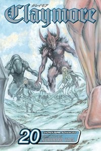
CLAYMORE

Vol. 20
(by Norihiro Yagi, Viz Media, $9.99)
FROM THE BACK COVER:
"In a world where monsters called Yoma prey on humans and live among them in disguise, humanity's only hope is a new breed of warrior known as Claymores. Half human, half monster, these silver-eyed slayers possess supernatural strength but are condemned to fight their savage impulses—or lose their humanity completely.
Rebel Claymores Deneve, Helen and Yuma return to the Holy City of Rabona and find it under attack by Yoma hordes. An all-out battle ensues, after which Galatea informs the recently returned Claymores about Miria's solitary and likely doomed quest to bring down the Organization. As Helen and Deneve investigate in separate assays, it becomes clear that the Organization is creating novel and terrifying breeds of Yoma warriors."
EVIDENCE FOR:
Volume 20 of Claymore starts out pretty ordinary—everyone just fighting as usual—but then presses onward and upward, finishing on a jaw-dropping plot point that turns the whole series around. Along the way, intriguing new characters join in the rebel cause, more monsters are slain in epic fashion, and we get a surprisingly in-depth look at the Organization's plans. The old complaint used to be that the bad guys were always lurking vaguely in the shadows, but with several scenes focusing on their activities, the battle lines are drawn much more clearly—and the story becomes more compelling as a result. Of course, it wouldn't be Claymore without the exhilaration of battle as well, where the action is as likely to be in the air as on land, and the Yoma appear in terrifying new forms. Norihiro Yagi's art remains unique and polished as ever, balancing delicate details with immense displays of power. Even after twenty volumes, every monster design still looks like a fresh creation, and the Claymores' swordfighting moves each have particular personal quirks. Enjoy the journey to the last page of this volume, because it's worth it.
EVIDENCE AGAINST:
Is the journey really worth it, though? Or is this volume just getting the benefit of the doubt because it ends on such a powerful note? Flip through the middle again, and it's clear that Claymore is still trying to get away with mindless repetition: blades flashing, swords clashing, warriors leaping ... Even if it involves new combatants and new creatures, it's the exact same mode of battle that's been happening the last 19 volumes. So yes, you get a hundred-plus pages of the same old Yoma-slaying, all for one shiny new plot point at the end. And while it may not have seemed possible, the character designs for the Claymores have become even more homogenized: the same steely-eyed, mildly angry expressions in every panel, a limited range of short-to-medium hairstyles (unless you're an "important" warrior like Anastasia of the Fancy Curls), and identical body types and outfits for all. The featureless backgrounds don't offer much to look at either, as they basically flip between generic mountains, plains, or forest settings. It may be polished and detailed, but that's not ths same as being visually interesting.
FINAL VERDICT:
Nothing wrong with "doing the same thing over and over" when it works so well, capturing the spirit of battle and leading up to a major turning point. The action and story are good enough for a B this time.
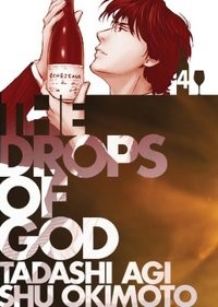
THE DROPS OF GOD

Vol. 4
(by Tadashi Agi and Shū Okimoto, Vertical, $14.95)
FROM THE BACK COVER:
"The international bestseller continues as wine novice Shizuku takes on in turn the scion of a retail chain, a mystery writer at odds with her difficult past, and last but not least his archrival, genius taster Issei Tomine."
EVIDENCE FOR:
Once again, the secret to success in The Drops of God is that it is never just about wine. A brief interlude halfway through this volume proves it: two former lovers meet in a wine bar after decades apart, and in just 40 pages, this tear-jerker sweeps through the bittersweetness of romance gained and lost. The main storylines take longer to develop, but are just as engaging—from Shizuku's calculated takedown of a brand-obsessed entrepreneur (like so many things in life, his problems all come back to peer pressure) to the intricate clues surrounding the "Second Apostle" of Shizuku's father's legendary collection. As expected, the wine trivia is a geek's paradise of in-depth facts and terminology, but general descriptions and romantic metaphors give the subject an accessible side as well. Lavish artwork also helps bring the metaphors to life: eye-catching backgrounds, mystical figures and a dreamy, lightly-shaded style are a treat for the eyes. Attractive character designs, epic wine-pouring poses and an unexpected jaunt into the heart of the Gobi Desert also provide visual interest from the real-life side of things.
EVIDENCE AGAINST:
The Drops of God does a fine job of bringing non-wine-related matters into the story—but there is such a thing as trying too hard, as seen in the messy mystery-writer subplot. The idea of a sinister-looking, unlabeled wine bottle that one must identify or die trying sounds intriguing, but the way it's crammed right into the Second Apostle storyline just doesn't work. Famous sleuths don't try to solve two mysteries at once, so why should Shizuku? To make matters worse, the denouement is all but incomprehensible: the more the culprit tries to explain the motives and method, the more it sounds like wild, improvised drivel. Fortunately, the rest of the book makes more sense ... except for the early chapters where Shizuku and friends are rooting around for bargain wines to beat the big-name brands. With everyone spouting French names and flowery descriptions at each other, this cloud of words will end up floating over the heads of common folk. So much chatter also results in uninteresting visuals, with panel after panel of faces locked in conversation.
FINAL VERDICT:
The story runs smoothly for a while, but then comes the mystery writer to make the second half unnecessarily complicated. This one's a B-, which could have been higher if not for storytelling hiccups.
THE EARL AND THE FAIRY

Vol. 2
(by Ayuko, original concept by Mizue Tani, Viz Media, $9.99)
FROM THE BACK COVER:
"Lydia Carlton is a fairy doctor,one of the few people with the ability to see the magical creatures who share our world. During one of her rare trips to London to visit her father, Lydia's quiet life is suddenly transformed when she is rescued from kidnappers by a mysterious young man!
Edgar and his small band must travel to the Isle of Manan, once home to The Blue Knight Earl. But the island is surrounded by merfolk, whose tragic songs cause rough seas and shipwrecks. And even if Edgar and his companions reach the island, they face death if it turns out he isn't a true heir to the Earl..."
EVIDENCE FOR:
Not to spoil anything, but this volume of The Earl and the Fairy is one worth reading all the way through to the finish. Volume 2 marks the end of a major story arc, and as a finale, it's truly grand: plot points fall into place and get resolved, good and evil meet in high-stakes combat, and best of all, our heroine Lydia finally gets her moment of glory in a shimmering visit to the fairy realm. Yes, Ayuko draws a pretty decent British countryside, but it's the elements of magic that bring out her best art: enchanted swords, surreal spells, and creatures of otherworldly beauty. Even minor mascot characters add a touch of storybook cuteness—and play a crucial role when needed. The events leading up to the big battle have their moments too: an ill-fated romance, a family member's surprise appearance, and a puzzle-solving treasure hunt all add to the suspense. Suffice to say, this volume goes on a winding trail full of surprises—and half the fun (actually, most of it) comes from following along.
EVIDENCE AGAINST:
If this is a trail, then it's the kind full of dust clouds and irritating plants that just make you feel awful later. There may be some neat surprises in store, but they're often wedged in between long stretches of conversation that are boring at best, and confusing at worst. How long must Edgar's servant wail about the Earl's plan to sacrifice a life for the treasure sword? How many pages must Lydia occupy with her monologues about whether to trust Edgar or not? These mind-numbing scenes also make for poor visual entertainment, as readers will have to slog through panel after panel of facial close-ups and blank or abstract-patterned backgrounds. Apparently, the charming ambience of the Victorian era is just too much hassle to draw. When the action finally kicks in and Edgar and Lydia go hunting for the sword, even that plot point turns out to be a hack job: all they're doing is following a checklist as written in an ancient poem, not really solving puzzles. This thrill ride to a magical destination just doesn't live up to the billing.
FINAL VERDICT:
In the end, an enchanted finale to the first story arc can't make up for all the pain and boredom that precedes it, and a C- is all it gets.
UNTIL DEATH DO US PART

Vol. 1
(by Hiroshi Takashige and DOUBLE-S, Yen Press, $18.99)
FROM THE BACK COVER:
"Haruka is a young girl who is able to predict the future with incredible accuracy—an ability that has made her a target. When she is kidnapped, Haruka uses her power to seek out someone who can help her, fixing upon a blind man amid the crowded streets of Tokyo. Though a seemingly odd choice, Haruka's powers have not led her wrong, as her chosen protector draws a sword from his walking stick and deftly takes out her captors. Knowing she will always be pursued for her gift, Haruka begs the mystery swordsman to keep her safe ... 'Until Death Do Us Part.'"
EVIDENCE FOR:
A blind swordsman? A "lone wolf" protecting a "cub" from countless attackers? Until Death Do Us Part may echo some samurai classics, but it's a contemporary urban thriller all the way. As a tale of good versus evil, it's the complete package: epic one-against-a-hundred shootouts, mind-blowing sci-fi gadgetry, and just the slightest hint of the supernatural. The first chapter opens with lightning-fast action and rarely lets up afterward: there's always another firefight around the corner, with new combatants and weapons each time. The story itself also blossoms far beyond the original "tough guy protects innocent girl" premise, introducing a world of high-tech terrorism, special-ops military action, and secret scientific projects. With so many characters coming and going, and so many subplots churning about, it's impossible to be bored with the series. The polished, semi-realistic artwork is also a key element: artist DOUBLE-S manages to find the perfect freeze-frame pose for every swing of the sword, every bullet fired, and every kick to the stomach. Clean, well-spaced layouts allow the fights to flow naturally from panel to panel, making this a series where the images really do speak for themselves.
EVIDENCE AGAINST:
Having a deep, multi-faceted story sounds like a good idea ... until it loses track of what it was about in the first place. By the volume's second half, Haruka has become a useless figurehead who sits around while all the people with weapons have fun. If anything, there are too many characters engaged in combat by the time the plot hits full stride—there's Mamoru the blind swordsman on one quest, the special-ops force running a different mission, and even the police have their own ideas about what must be done. The characters are also too heavily based on action-genre stereotypes: right at the center we have the damsel in distress and her single-minded protector, then there's the eccentric tech guy, the gun-toting paramilitary agents, even a grizzled cop (and his naïve partner) conducting some behind-the-scenes investigation. Seriously, it's like they just grafted all the usual action tropes into one big clump. The artwork has weak spots as well: villains are lazily drawn, backgrounds often lack detail, and some of the later shootouts aren't nearly as stylish as the one-on-one sword fights from earlier.
FINAL VERDICT:
It's true that the elements of this series may seem very generic—but the complexity and sheer action also make it very fun, and worthy of a B+.

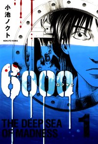
6000: THE DEEP SEA OF MADNESS

Vol. 1
(by Nokuto Koike, Gentosha, ¥590)
SUMMARY:
"Deep beneath the Philippine Sea, 6000 meters below sea level, lies a state-of-the-art research facility. However, it was abandoned three years ago after a mysterious accident killed all the personnel there. A Chinese conglomerate has taken ownership and hopes to get the facility running again, and Kengo Kadokura—an office worker whose company was merged into the conglomerate—accepts the undersea job rather than getting laid off. However, after Kadokura's co-worker Danzaki gets badly injured working there, he starts to have doubts about heading into the deep. After a few more unusual incidents at the facility, it seems Kadokura's doubts are well-founded..."
EVIDENCE FOR:
The genius of 6000 is that is starts out so ordinary: between the salaryman protagonist, his demanding boss, and a quick-tempered engineer, it sounds like a typical workplace scenario (albeit in an unusual workplace). Then the freaky stuff starts happening—a powerful contrast between mundane characters and decidedly non-mundane events. It also works because of the subtle horror that creeps into one's brain: machines start acting up, strange faces flash for a moment then disappear, and people start imagining things that aren't there. That blurring between hallucination and reality is one of the most effective scare tactics—what could be more frightening than the demons in your own mind? There are some big-time shock moments, but the story delivers them as quick, raw bursts of pain rather than over-dramatizing the issue. The artwork also stays in tune with series' shifting moods, starting out with clean, precise lines to match the high-tech setting, then layering on the shadows and deep blacks as the deep-sea environment grows ever more oppressive. Of all the great horror villains out there, none is scarier than the one that surrounds you on all sides.
EVIDENCE AGAINST:
If 6000 is trying to capture the day-to-day feel of the office in the first few chapters, it does the job a little too well. A lot of the early storyline in this volume focuses on dull business concerns, with Kadokura trying to understand the facility and having various conversations about how the place is run. There are some hints about the horrors to come, but the series' slow start will test the patience of some readers. It also doesn't help that most of the backgrounds are utilitarian rooms and hallways, or just plain white—hardly the kind of art to set a creepy mood. As the story progresses, it also misses out on chances to develop the characters: for example, the friendship between Kadokura and former co-worker Danzaki is never filled out, even though an incident involving Danzaki is one of the major fear triggers. In another case, an employee freaks out over a vision of her father—yet we never find out what kind of relationship she had with him. The series is so focused on strange, inhuman things that it forgets the human element.
FINAL VERDICT:
Fans of "closed room" horror scenarios will definitely enjoy the disturbing quality of this series, although the gradual pace suggests it'll take a few more volumes for the story to really blossom.

In this column, loyalty does go rewarded—and it's hard to find anyone more loyal than repeat reviewer Eric P. So here's his take on a series that (unfortunately) remains incomplete in translation. But is it still worth picking up? Find out below ...
TRANSLUCENT

Vols. 1-3
(by Kazuhiro Okamoto, Dark Horse, $9.95 ea.)
In this world, there is an illness called Translucent Syndrome, where a person's body can literally fade, sometimes to the point of invisibility. Nobody knows the cause or cure, but schoolgirl Shizuka must deal and live with this affliction. At the start it was just her arms that faded in and out of view, before she started going through a period where her whole body threatened to turn invisible permanently, and now on average she lives mostly like a sporadic ghostly silhouette. She was introverted to begin with, so if anything her illness adds to her own personal issues and making her life more difficult. Yet she struggles regardless, with dreams of being an actor despite her condition and her low self-confidence, because it's the only time she ever feels noticed. She has a friend in popular-girl Okouchi, who ironically wanted Shizuka's condition to stop being noticed. Shizuka also has further support in her male friend and possible love interest, Tadami, a well-meaning but spaced-out nerd who is almost always in his own world. Shizuka also identifies with an adult friend who shares her condition named Keiko, who is always invisible except for the rarest of moments, and makes Shizuka reflect on her own possible future.
It's rare to read a story concept in a manga that is so beautifully metaphorical, in that you know just what everything is supposed to represent and symbolize. It feels like something plenty of readers could relate to right off the bat, and everything feels so real despite the fantasy elements. And it hits hard when Shizuka says lines like "Even the sun doesn't notice me" and "Am I really here?"
Despite all the good things, there are still some imperfections that stop it short from being a drama masterpiece. One, the art style renders the character imagery a little flat-looking. Two, there is no fixed storyline, making this manga episodic. The chapters get rather repetitive about Shizuka coming to terms with herself and seeming to resolve them in different ways, then the cycle repeats itself. Lastly, this is classified as a shoujo manga, albeit one authored by a male manga-ka. That much seems evidenced by the bits of fan-service-y elements that get sneaked in, namely scenes of Shizuka "disguising" herself in her translucence by being nude, a few too many convenient navel-shots of the girls, and a couple of typical yet unnecessary boob-grabbing moments between girls.
Despite these, the ideas alone behind this series are sweet enough, and it does have its funny moments. It's technically a 5-volume series, but for whatever reasons Dark Horse has only published the first three, the last having been published back in 2008. While it seems this is all we're getting, there's no real awkward cliffhanger at the end of the last volume. Even with just three volumes it feels self-contained enough with everything it wanted to say with its characters, themes and messages.
Is there a hidden gem of manga you'd like to reveal to the world? Is there a piece of garbage that deserves to be bashed in public? Or is there a title that didn't get a fair grade here, and you want to set the record straight?
Now's YOUR chance to be the reviewer! Write a review of about 300-400 words (a little more or less is fine) and include:
- Your name
- Title of manga (and volume no., if applicable)
- Author/Artist
- Publisher
- Briefly describe the story, then explain why this manga is great, terrible, or in between. Be objective, but also be entertaining.
Then send it in to rtoreaders (at) gmail (dot) com (plain text format preferred). One review will be selected out of all the submissions and will be published in the next column. All types of manga and manga-inspired comickry are accepted, from past and present, from Japan and beyond—what matters is that it's the Reader's Choice! NOTE: Submissions may be edited for formatting and grammar.
discuss this in the forum (6 posts) |