| View previous topic :: View next topic |
| Author |
Message |
|
|
|
HanaBana
Joined: 13 Apr 2010
Posts: 12
|
 Posted: Sat Sep 22, 2012 11:19 am Posted: Sat Sep 22, 2012 11:19 am
|
 |
|
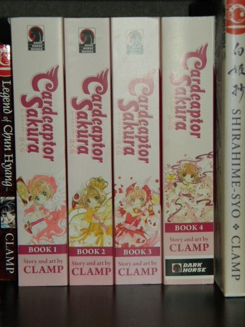
So I've been collecting the omnibus versions of Card Captor Sakura as they've come out. I have yet to get volume 4 and I'm seriously considering never getting it after seeing this.

So I know Dark Horse is going through a logo change, but was it really necessary to change the logo for the very last volume in the set? Is there any chance of a reprint with the original logo? I seriously just want to ask what exactly is the thought process behind this? Wouldn't they know this would piss off fans when they designed the cover?
|
| Back to top |
|
|
|
Bonham
 Joined: 20 Nov 2010
Posts: 424
Location: NYC
|
 Posted: Sat Sep 22, 2012 12:03 pm Posted: Sat Sep 22, 2012 12:03 pm
|
 |
|
|
God, it's gonna be annoying for my girlfriend and everyone else who values consistency.
Is this a one-time thing? Thought I read elsewhere that other series reverted back to the previous designs after Dark Horse used this ugly strip on the spine.
|
| Back to top |
|
|
|
NeburPT
 Joined: 22 Mar 2012
Posts: 101
Location: Portugal
|
 Posted: Sat Sep 22, 2012 12:52 pm Posted: Sat Sep 22, 2012 12:52 pm
|
 |
|
| Bonham wrote: | | God, it's gonna be annoying for my girlfriend and everyone else who values consistency.
Is this a one-time thing? Thought I read elsewhere that other series reverted back to the previous designs after Dark Horse used this ugly strip on the spine. |
I buy Gantz regularly and they also changed the logo for volume 22, but after that it went back to the original one in 23 and 24, so I'm guessing it's not going to happen again.
|
| Back to top |
|
|
|
|
HanaBana
Joined: 13 Apr 2010
Posts: 12
|
 Posted: Sat Sep 22, 2012 12:58 pm Posted: Sat Sep 22, 2012 12:58 pm
|
 |
|
| NeburPT wrote: | | I buy Gantz regularly and they also changed the logo for volume 22, but after that it went back to the original one in 23 and 24, so I'm guessing it's not going to happen again. |
That might mean a chance of getting a reprint of volume 4 with the original logo. Guess I'll just wait it out for a while. Thanks for the info!
|
| Back to top |
|
|
|
RAmmsoldat
 Joined: 19 Oct 2005
Posts: 1261
Location: North wales coast
|
 Posted: Sat Sep 22, 2012 1:13 pm Posted: Sat Sep 22, 2012 1:13 pm
|
 |
|
|
with the state of the industry at the moment if this kind of thing is your biggest gripe then consider yourself fortunate. I know its nice to have a uniform collection and such but I gotta wonder is the manga so weak you'd drop the last volume over something so trivial?
I'm collecting gantz myself and am a bit behind the times so i got regular volumes 1 and 2 and then volumes 3 and 4 have the new logo and then volumes 5,6,7 and 8 are back to old. same with some of my tokyopop books some have the very discrete logo on and others have the big red blob, it looks sloppy but I'm more interested in the content and actually being able to buy the books.
|
| Back to top |
|
|
|
|
HanaBana
Joined: 13 Apr 2010
Posts: 12
|
 Posted: Sat Sep 22, 2012 1:28 pm Posted: Sat Sep 22, 2012 1:28 pm
|
 |
|
| RAmmsoldat wrote: | | with the state of the industry at the moment if this kind of thing is your biggest gripe then consider yourself fortunate. I know its nice to have a uniform collection and such but I gotta wonder is the manga so weak you'd drop the last volume over something so trivial?
I'm collecting gantz myself and am a bit behind the times so i got regular volumes 1 and 2 and then volumes 3 and 4 have the new logo and then volumes 5,6,7 and 8 are back to old. same with some of my tokyopop books some have the very discrete logo on and others have the big red blob, it looks sloppy but I'm more interested in the content and actually being able to buy the books. |
I have the original CCS volumes from Tokyopop but I decided to double dip for the omnibus because they're so nice and I wanted to display them on my shelves. The fourth volume kinda ruined that for me and I know the inconsistency will always bother me if I do get it. It's such a little thing for me to be disappointed over and I know that. But it's also a little thing that DH would have no reason to fix if they cared at all for the overall quality of the collection.
|
| Back to top |
|
|
|
Vata Raven
 Joined: 21 May 2007
Posts: 710
Location: TN
|
 Posted: Sat Sep 22, 2012 4:15 pm Posted: Sat Sep 22, 2012 4:15 pm
|
 |
|
| HanaBana wrote: |
| RAmmsoldat wrote: | | with the state of the industry at the moment if this kind of thing is your biggest gripe then consider yourself fortunate. I know its nice to have a uniform collection and such but I gotta wonder is the manga so weak you'd drop the last volume over something so trivial?
I'm collecting gantz myself and am a bit behind the times so i got regular volumes 1 and 2 and then volumes 3 and 4 have the new logo and then volumes 5,6,7 and 8 are back to old. same with some of my tokyopop books some have the very discrete logo on and others have the big red blob, it looks sloppy but I'm more interested in the content and actually being able to buy the books. |
I have the original CCS volumes from Tokyopop but I decided to double dip for the omnibus because they're so nice and I wanted to display them on my shelves. The fourth volume kinda ruined that for me and I know the inconsistency will always bother me if I do get it. It's such a little thing for me to be disappointed over and I know that. But it's also a little thing that DH would have no reason to fix if they cared at all for the overall quality of the collection. |
The damn logo doesn't change the damn overall quality of the damn manga. The logo only covers a little tiny space of the cover, not like they're covering the cover image with it. Logos change, it's simple as that, I have other mangas that have logo change for random volumes and go back to the original a volume later. TokyoPop and Viz have been both known to do this, it's a way to change things up and make the logo more eye catching.
And DarkHorse isn't going to be any different. And they're a American comic company first and manga second. The logo change on everything they printed, just not the manga.
|
| Back to top |
|
|
|
Brand
 Joined: 30 Jan 2006
Posts: 1029
|
 Posted: Sat Sep 22, 2012 4:21 pm Posted: Sat Sep 22, 2012 4:21 pm
|
 |
|
|
I'm still annoyed with Viz. The printed the first three volumes of Utena in a larger size (which was standard for them then) and then the last two were printed in the more common smaller size.
I do find this inconsistencies annoying but I keep buying to support tittles I like.
|
| Back to top |
|
|
|
|
Altacia
Joined: 11 Feb 2004
Posts: 286
|
 Posted: Sat Sep 22, 2012 5:39 pm Posted: Sat Sep 22, 2012 5:39 pm
|
 |
|
|
It really does stick out on that pink spine but... It doesn't look as bad as I thought it was going to look.
Too bad it completely ruins the Water God spines.
Won't stop me from buying them though, Just baffling that they'd change to such a gaudy logo on series that are almost finished/long ran.
I don't remember who it was but, one company switched logos on new series but kept the old ones on older series to not disrupt the flow.
|
| Back to top |
|
|
|
|
HanaBana
Joined: 13 Apr 2010
Posts: 12
|
 Posted: Sat Sep 22, 2012 5:58 pm Posted: Sat Sep 22, 2012 5:58 pm
|
 |
|
| Altacia wrote: | | I don't remember who it was but, one company switched logos on new series but kept the old ones on older series to not disrupt the flow. |
Not sure if it's the company you're thinking of but Kodansha has been really good about this. All the series they continued from Del Rey they used a very similar logo with only the name on it changed so it still looks consistent all lined up. The series' Kodansha started use a completely different logo.
|
| Back to top |
|
|
|
|
Altacia
Joined: 11 Feb 2004
Posts: 286
|
 Posted: Sat Sep 22, 2012 6:23 pm Posted: Sat Sep 22, 2012 6:23 pm
|
 |
|
| HanaBana wrote: |
| Altacia wrote: | | I don't remember who it was but, one company switched logos on new series but kept the old ones on older series to not disrupt the flow. |
Not sure if it's the company you're thinking of but Kodansha has been really good about this. All the series they continued from Del Rey they used a very similar logo with only the name on it changed so it still looks consistent all lined up. The series' Kodansha started use a completely different logo. |
Wasn't them, Was further back...
Now that you mention Kodansha though, I had never noticed the switch. haha. Of course they never released another volume of Ghost Hunt and Arisa is the only other Manga that I had continued from the merge.
They did do a nice job blending their own logo into DelReys.
VIZ's new Loveless Volume looks nothing like TokyoPops, It looks better {Sorry TP.}. Though, That switch isn't very bothersome...
|
| Back to top |
|
|
|
RAmmsoldat
 Joined: 19 Oct 2005
Posts: 1261
Location: North wales coast
|
 Posted: Sat Sep 22, 2012 6:30 pm Posted: Sat Sep 22, 2012 6:30 pm
|
 |
|
| Altacia wrote: | |
VIZ's new Loveless Volume looks nothing like TokyoPops, It looks better {Sorry TP.}. Though, That switch isn't very bothersome... |
c'mon tokyopop was never ever known for quality, cant count the amount of books I've had from em that look dull and were full of spelling errors. They were passable-good so if they put something interesting out it was worth a look but their bar was set pretty low sometimes
|
| Back to top |
|
|
|
Alan45
 Village Elder
 Joined: 25 Aug 2010
Posts: 10030
Location: Virginia
|
 Posted: Sat Sep 22, 2012 6:56 pm Posted: Sat Sep 22, 2012 6:56 pm
|
 |
|
RAmmsoldat wrote:
| Quote: | | c'mon tokyopop was never ever known for quality |
Which is why I'll ignore the change in the Dark Horse logo. Their version is larger, on better paper and much better in print quality.
|
| Back to top |
|
|
|
|
osakaedo
Joined: 13 Aug 2004
Posts: 66
|
 Posted: Sat Sep 22, 2012 7:30 pm Posted: Sat Sep 22, 2012 7:30 pm
|
 |
|
| Vata Raven wrote: | |
And DarkHorse isn't going to be any different. And they're a American comic company first and manga second. The logo change on everything they printed, just not the manga. |
Dark Horse and American publishers are not unique to this. Kodansha in Japan just switched their logo for BeLove and Kiss tankoubon. My Princess Jellyfish copies, I bought for Vertical, are like that. Doesn't bother me none.
|
| Back to top |
|
|
|
|
Jaymie
Joined: 18 Jun 2009
Posts: 915
|
 Posted: Sun Sep 23, 2012 6:26 pm Posted: Sun Sep 23, 2012 6:26 pm
|
 |
|
|
They will probably reprint it. Eventually. Just keep on the lookout.
|
| Back to top |
|
|
|
|